Sometimes things can take a really, really long time — a snail’s pace. My Orchid Hill House project is an example. I have worked on and off on it for many years. Each year it is on the list to finish it but some aspect would seem overwhelming and progress stalled out for a time.
I do believe the snail may actually be crossing the finishing line!
This project was my first project to electrify a multi-room dollhouse. Roomboxes have been my comfort zone for electrifying, so this has been a learning process. I have gained confidence now that all the lights are on and working!

Since it is a multi-room structure the furnishings, wallpaper, and flooring has to play well together. The coloring and style has to draw the eye smoothly from room to room. Dollhouses have to account for the fact that you are visually seeing all the rooms at the same time. In real life, your eyes only have to take in the details of one room at a time as you walk through them. Due to the my very slow work pace, I really thought through my choices instead of haphazardly making decisions just to complete it.
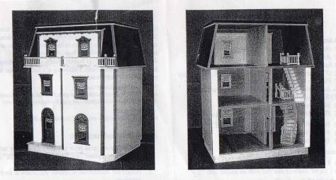
I am a bit perverse and decided to make the open back the front since I don’t have the space for viewing both sides. I decided early on that it is my dollhouse, so my rules.
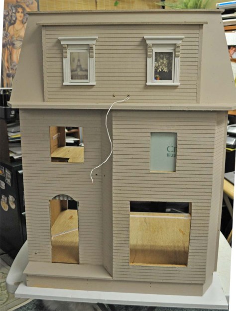
We all have our methods – for me it is a bit like childhood playtime – arranging and rearranging furniture pieces until I like the view and the purpose of each of the rooms take hold.
I did make structural changes to the rooms to make them work better for my final arrangements. I increased the window size in the drawing room to accommodate having built in bookcases and a window seat. Also, an enlarged archway to move from the entry area into the drawing room. The bedroom window was deleted to make room for a cozy fireplace. The window on the 2nd floor landing was enlarged to make a more interesting area instead of just a pass through spot of a stairway. The staircase was also modified from the original. Okay, it may seem like a lot but it was a process that I gave heavy thought to before each modification.
To have stairs or not was not a quick decision. Stairs can add to the realism of a dollhouse but can also take up a large foot print that limits the detail that you can put in the structure. So it is a balancing act. The stairs going from the main floor to the 2nd floor was enough for me. The top floor layout was hindered by stairs so they were left out for a better room arrangement. This house came with stairs but having a railing on BOTH sides of the stairs really narrowed its appearance. I knew something was bugging my eye appeal but I wasn’t really seeing it until one side of the railing fell off in the handling of the stairs in my many room rearranging. Ummm…. I can’t widen the stairs to the base with this set of stairs BUT I could curve the wall to match the inner curve of the stairs – much better!

Stairs with only the outside railing.

Curving the wall to match the stairs.
I could live with that! I filled in the railing holes with wood putty and covering the stairs with a carpet runner to hide the changes. As you guessed, figuring out a way to curve the stairway wall and its supports lead to another really long pause until I had some firm thoughts on how to do it. I did figure it out and you would think clear sailing but no, I would just see somethings else that I just couldn’t easily do and wander off to a different project to satisfy the creative whim until my enthusiasm returned.
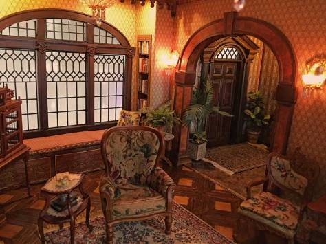
If I wandered through all the individual decisions this could be become a very long posting and put you to sleep. SO enough of the details this time and some photos that explore the first floor. More about the construction later but time for some eye candy now!
The parlor details…..
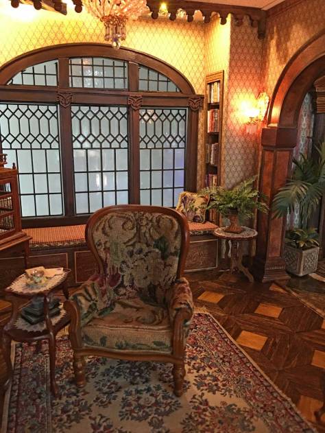
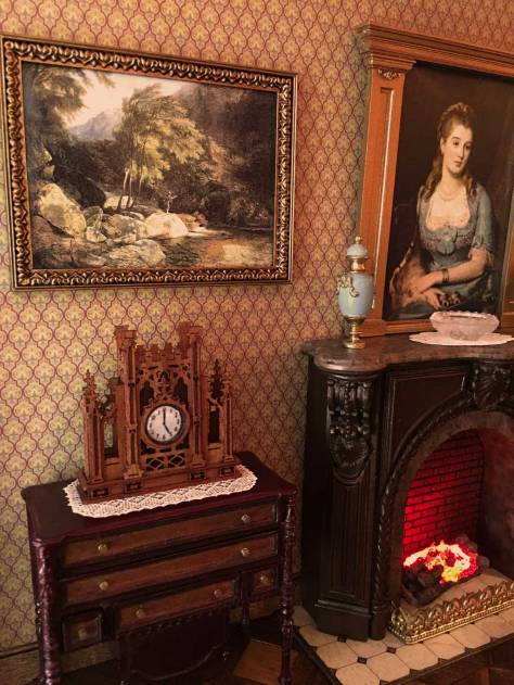
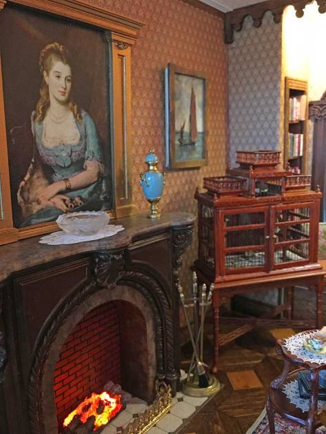

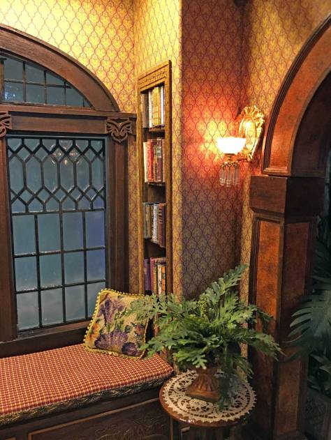
I will end with my favorite spot. The window seat with built in bookcases for the quiet escape into the pages of a book.
Hopefully, the photos tweak your interest and want to come back for more about Orchid Hill House. Until the next posting…………
